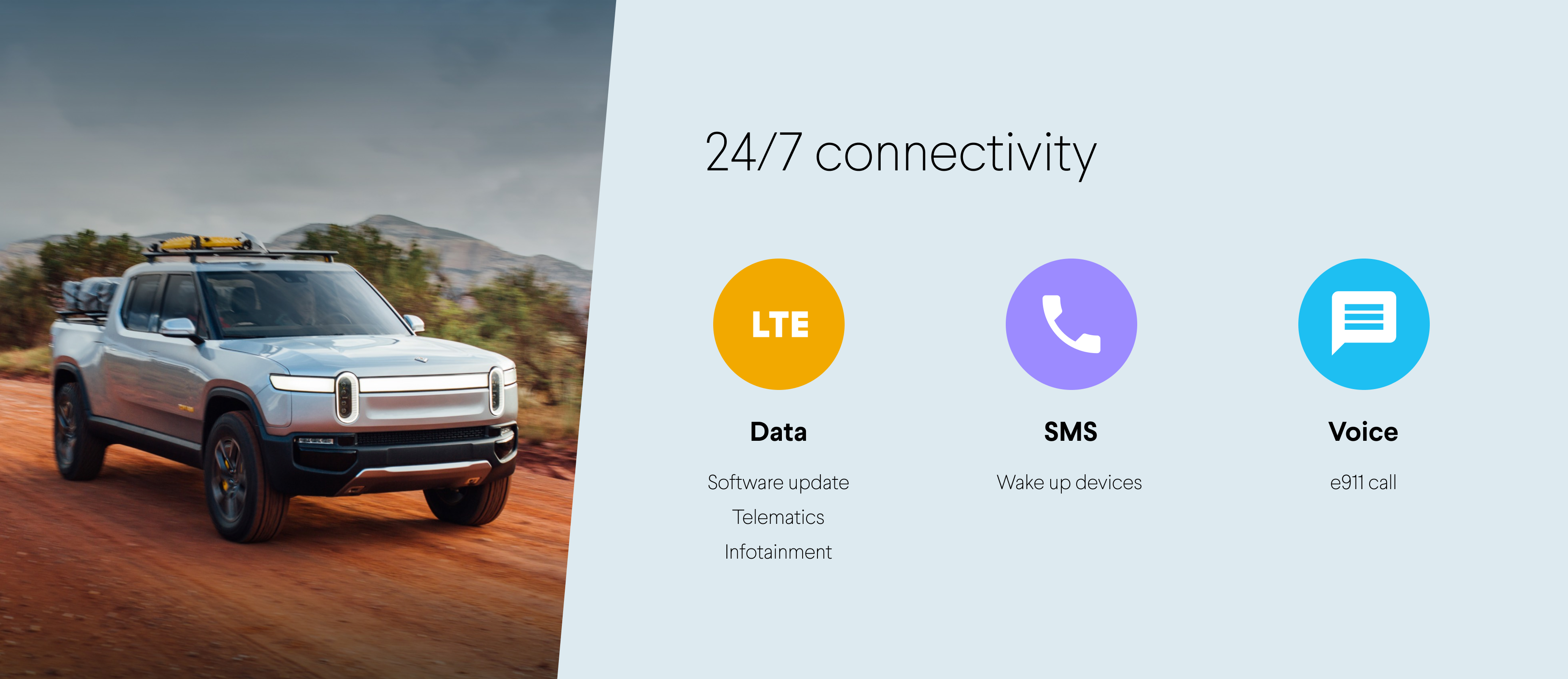
Rivian’s connectivity management platform manages both 25,000 Rivian EVs and 100,000 Amazon delivery vans. Connectivity allows vehicles to stay online 24/7 for status tracking, software updates, and remote troubleshooting. Every year, Rivian and Amazon pay carriers dozens of millions of dollars for cellular connectivity usage. The carrier bills keeping growing every year as more vehicles come online.
Both Rivian and Amazon wanted to have a holistic view of all connectivity related usage and costs and drill down to find ways to optimize. I teamed up with product managers, data scientists, and engineers to figure out how might we bring an analytics dashboard experience to the existing connectivity management platform.
I first identified two major users for the dashboard: connectivity managers and company leadership. Since company leadership isn't accessible for user research, I started by interviewing connectivity managers to understand their routine and pain points.

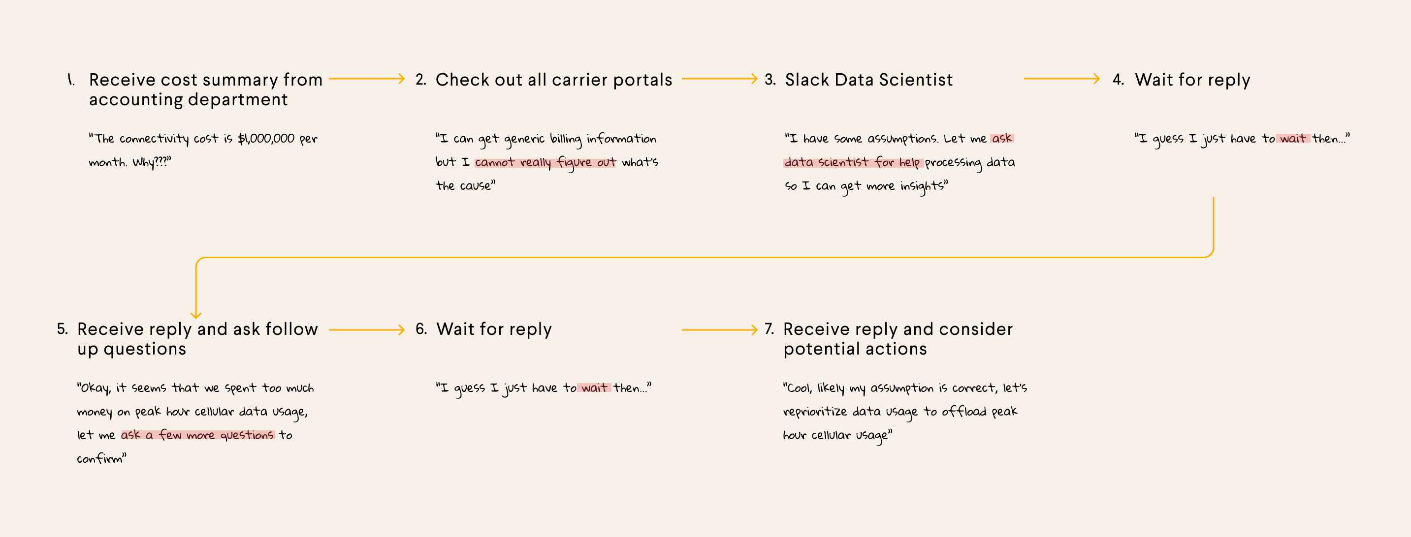
I created a storyboard mapping out a typical user journey of a connectivity manager trying to figure out ways to reduce connectivity data usage.
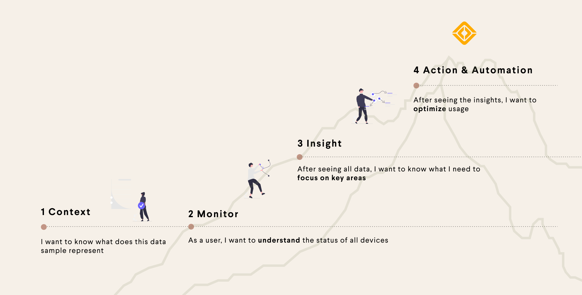
Though conversations with connectivity managers and data scientists, I created a diagram to summarize user needs.
After discussing my research findings with the team, we further defined the project goal to be designing a dashboard experience.
The dashboard will be made up of a set of key performance indicators relevant to a particular group of vehicles. So I divided the design into two parts: a contextual header summarizing the vehicles and widgets visualizing the KPIs. I first started by looking into the page layout options.
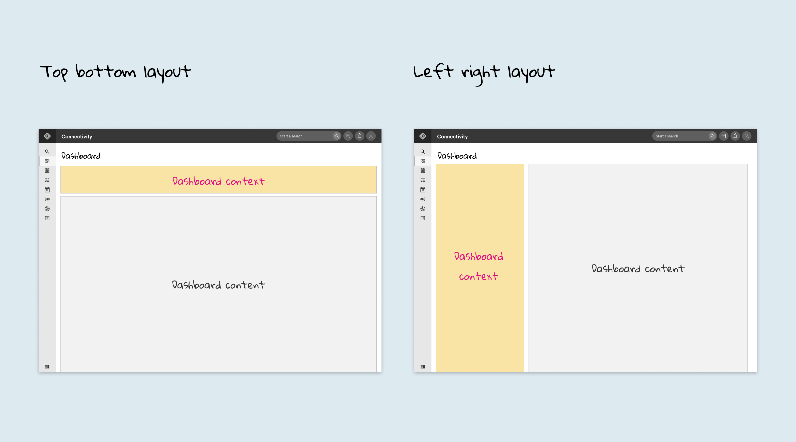
To save as much space as possible for widgets, I decided to go with the top/bottom layout.
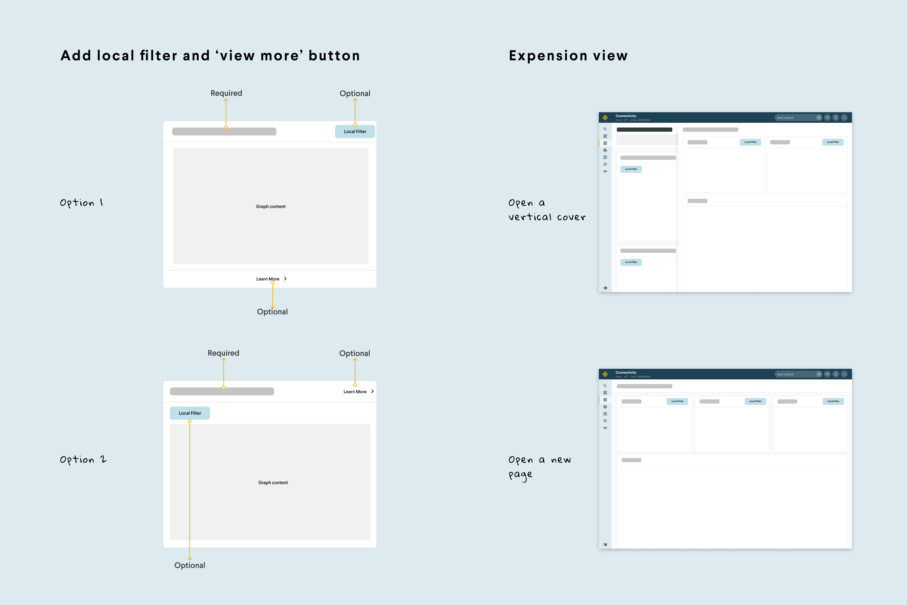
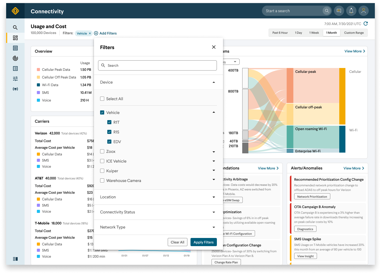
Then, I explored different options to see how to clearly show a particular group of devices and allow users to refilter the view based on their particular needs.
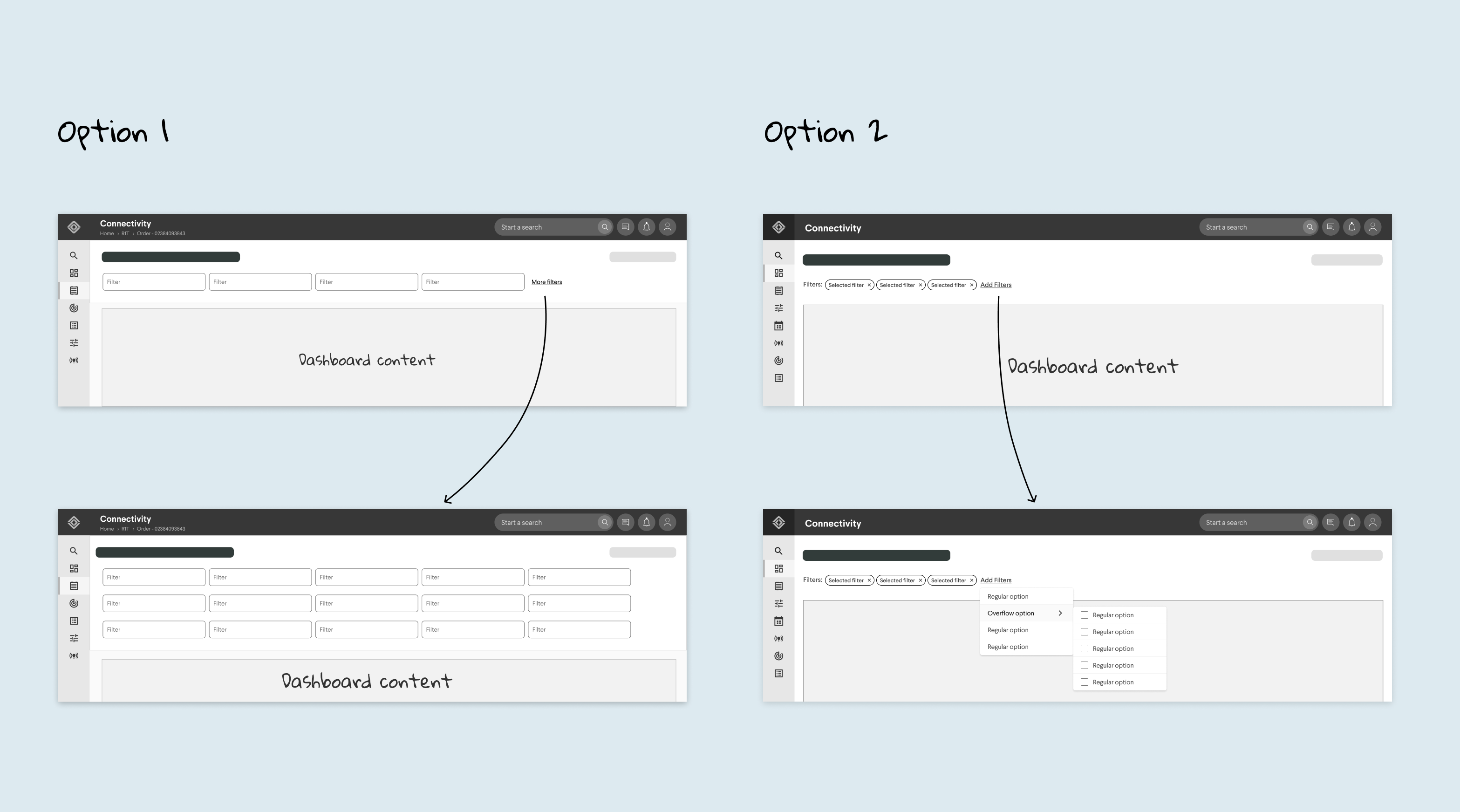
I decided to go with option 2 because it supports more complicated filtering patterns and allows users to see selected filter tags at any time.
Then I worked closely with product managers and data scientists to collect a list of data questions. We identified 4 data questions with high user value and high implementation feasibility. We also included an alert and recommendation system to proactively help users take actions to reduce usage and cost.
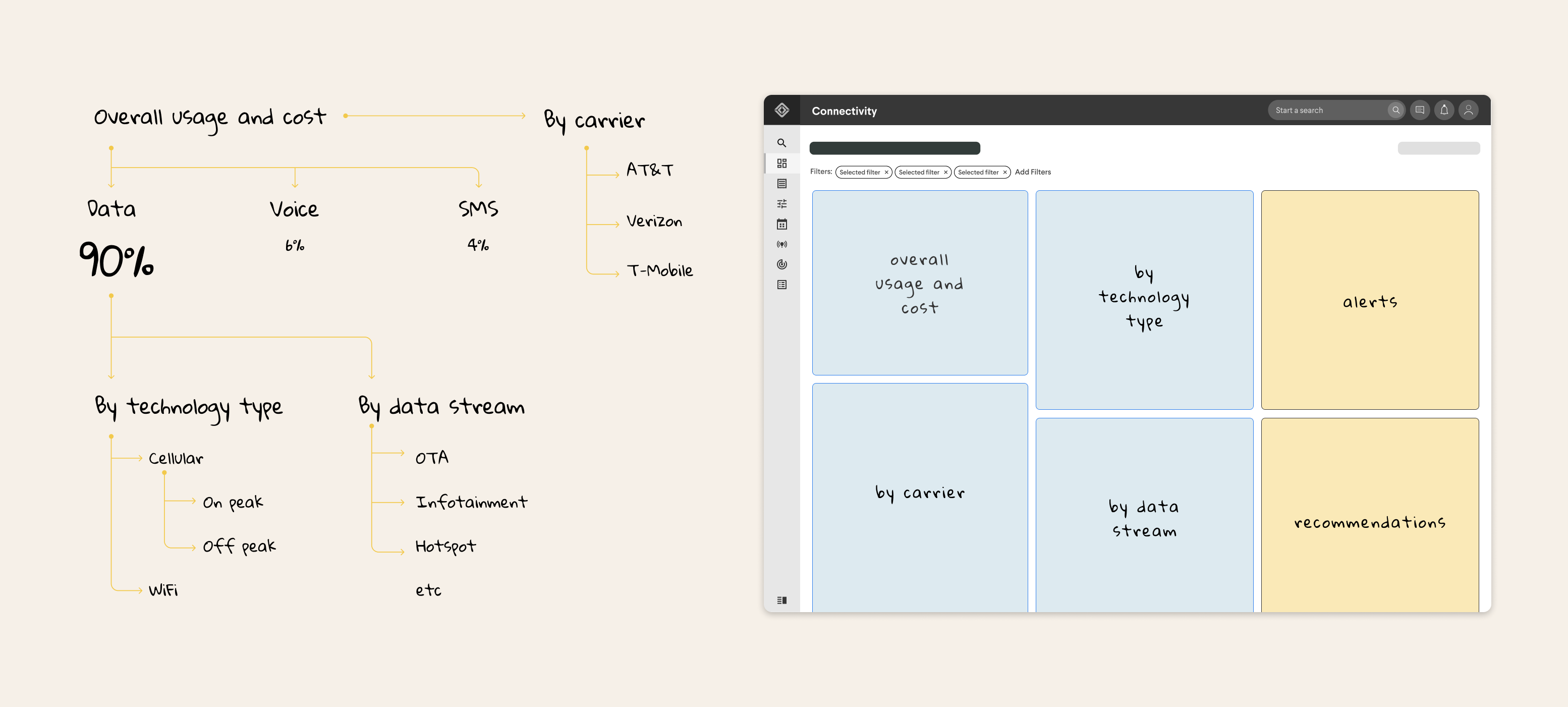
The low-fi wireframe helps us look at the dashboard content holistically. Users will be able to first understand the selected data and then drill down to get insights.
The next step was to iterate on the design with real data and figure out how to best visualize KPIs.

Because of the limited space, I cannot show both the trend graph and actual numbers at the same time.
The wireframe already seems very packed with actual data in the design. After discussing with a product manager, we visited all data questions and tried to think out of the box. What if we combine two data usage breakdowns into one?
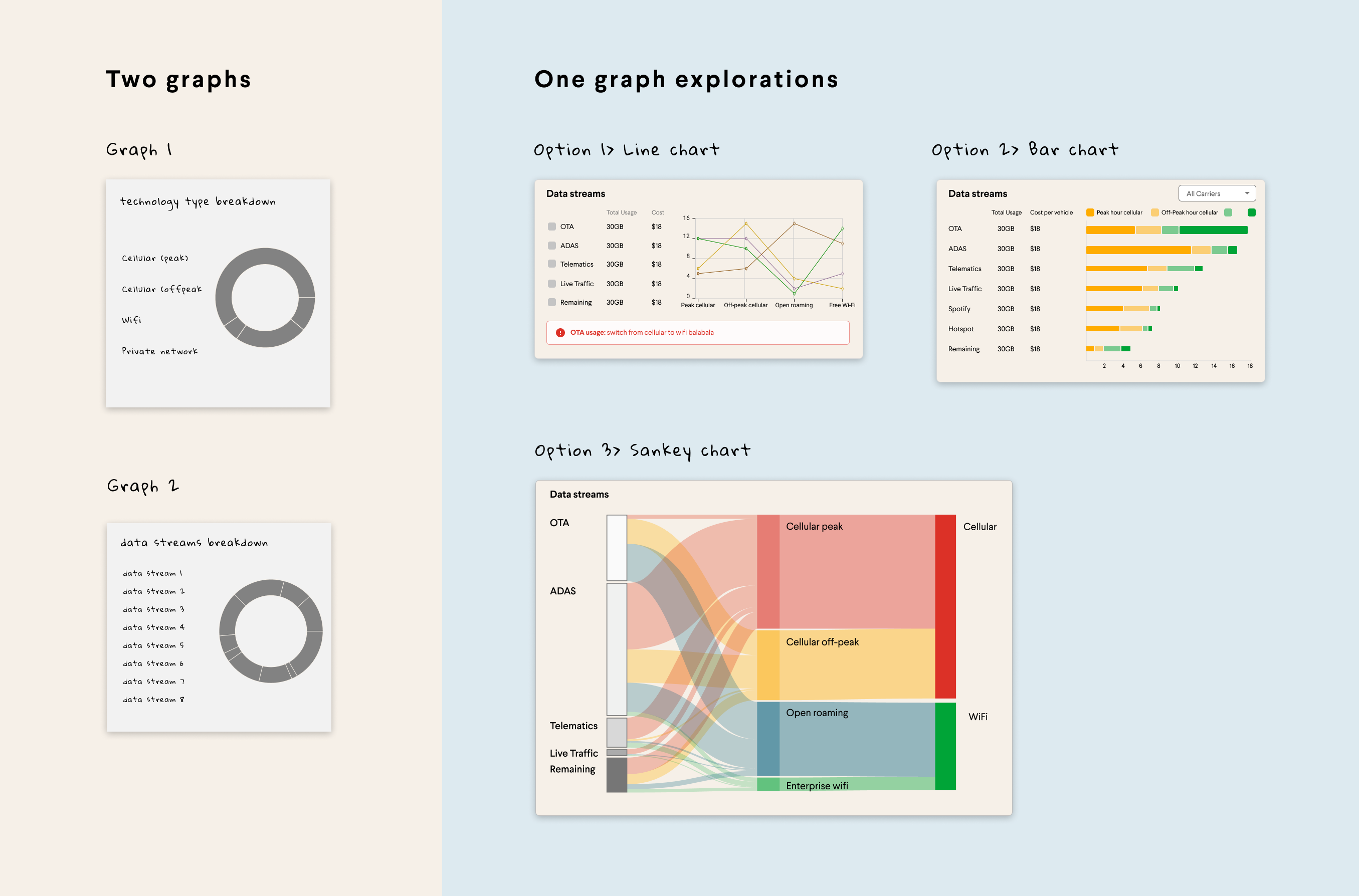
After comparing all the high fidelity explorations as a team, we all liked the Sankey graph option because it show a more complete data usage flow and consolidates two widgets into one.

In the new design, I consolidated data questions into three major widgets and reserved enough space to show both number and graph.
With most of the product requirements sorted out, the next challenge for me is to figure out how to further expand on the design and support data-driven actions.
Finally, because Rivian brand palettes don’t come anywhere close to meeting the demands of data visualization, I worked with our brand designers to tweak our existing color palette to meet new needs.
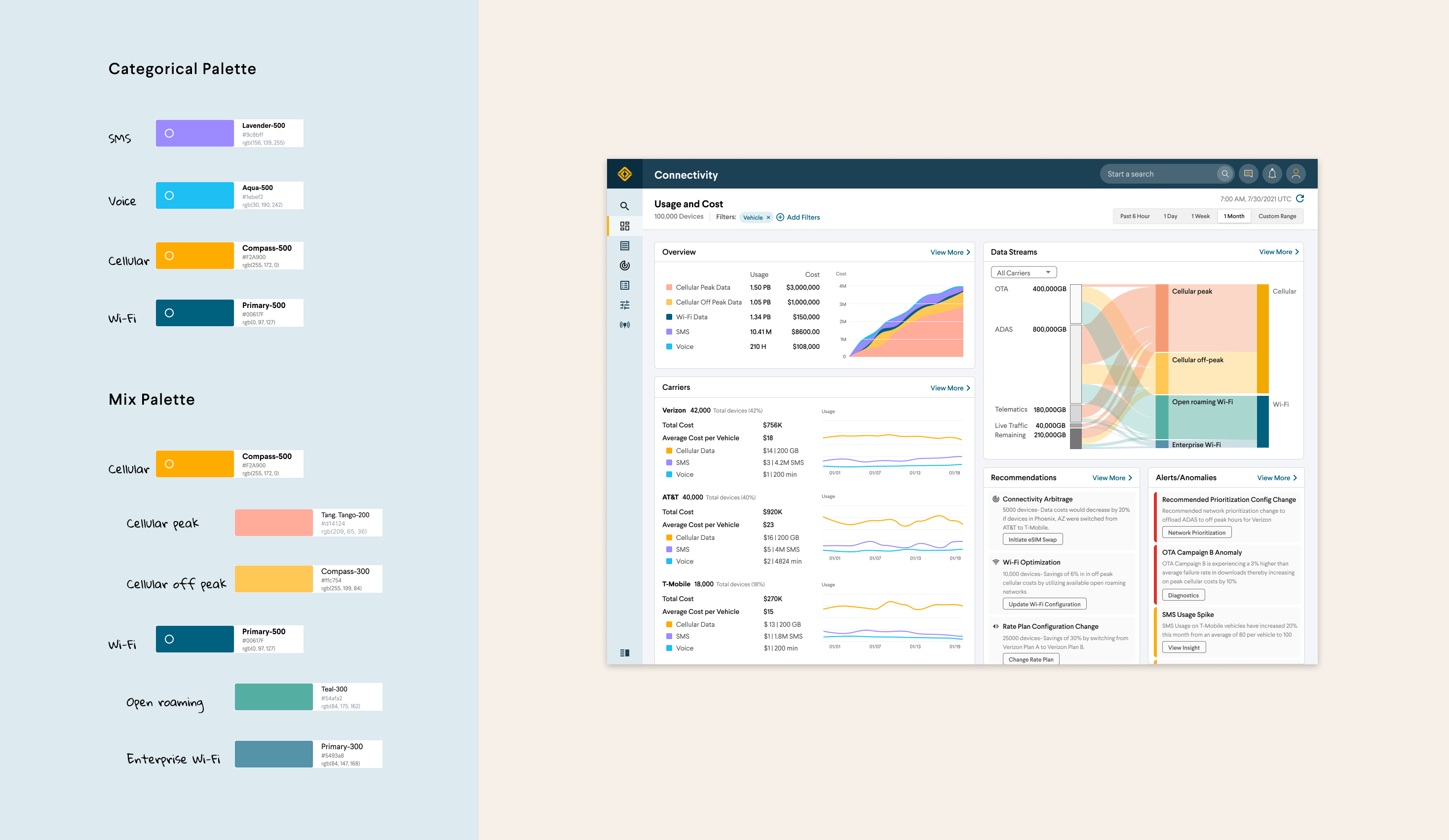
I decided to apply a categorical (or qualitative) palette to compare distinctly different categories. Usage types, carriers, and data streams are assigned their own unique colors. For sub-categories under cellular and Wi-Fi, I combined categorical colors and sequential colors.
After multiple design reviews and QAs with product managers, engineering, and the data team, we decided to ship the design quickly and collect feedback along the way with actual users.
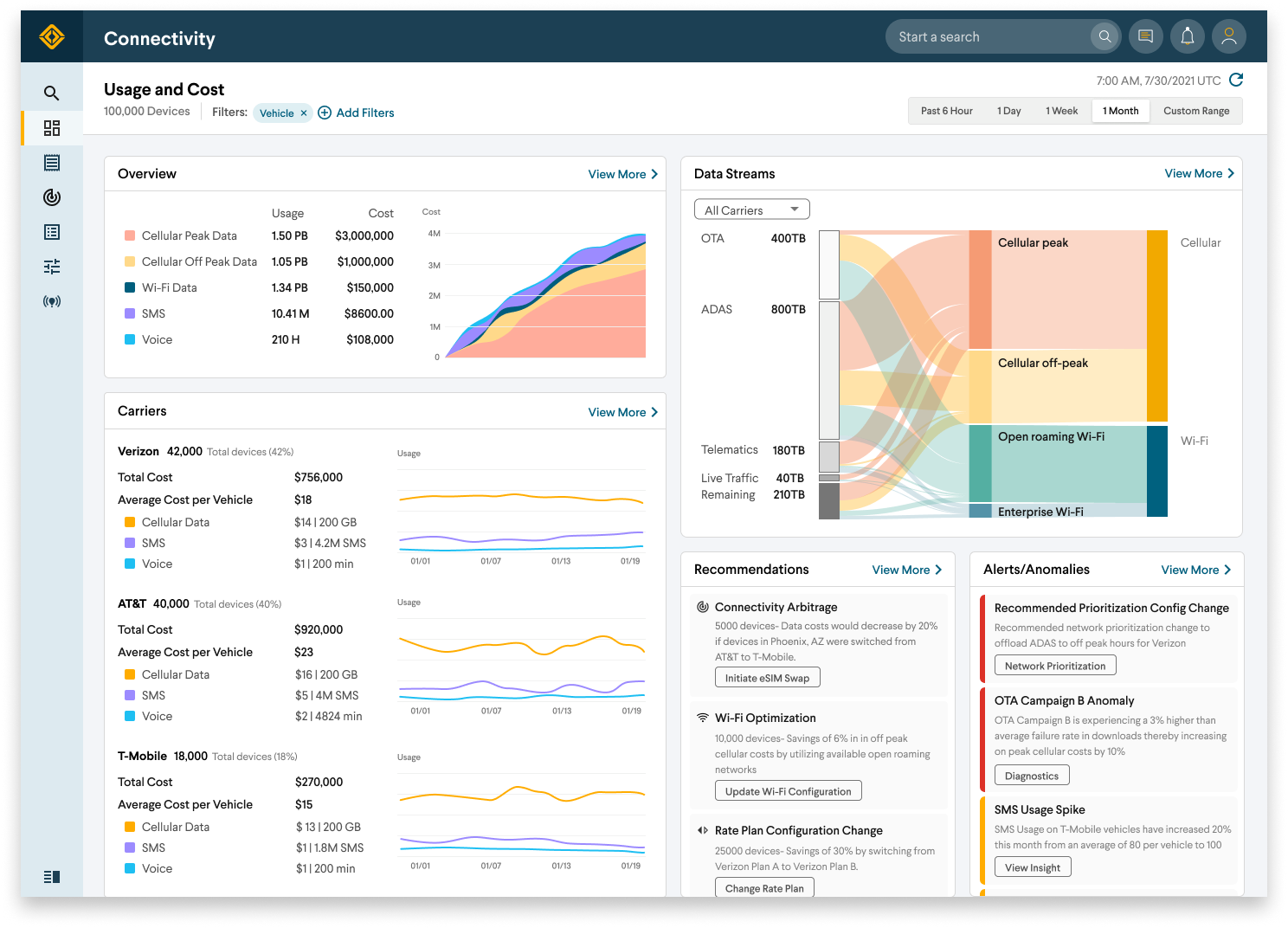
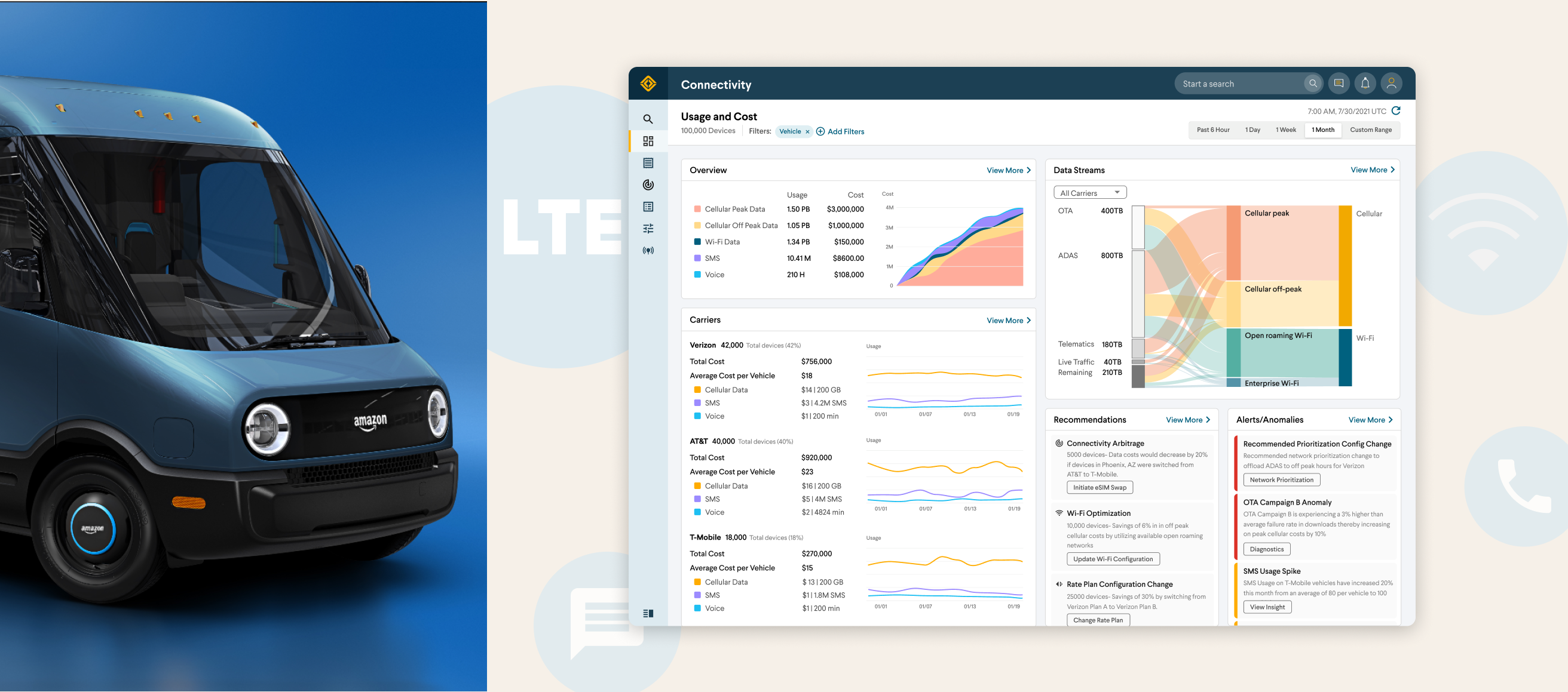
The user can easily see the data matching their filter and refilter as needed.
The user can see data, voice, and SMS usage across the board and dive deeper if necessary.
Due to the high impact of this project, I had multiple design reviews within the product organization and with Rivian leadership team to get design sign-off. I also led multiple design reviews with leadership teams from 10+ Amazon business units to get their buy-in. The final design is currently being built at Rivian.
- Support all Rivian vehicles and chargers
- Uncover connectivity usage and costs and make it accessible
- Point out ways to optimize usage and reduce costs
- Featured in Rivian IPO S1 video as part of Rivian’s long-term strategy illustration
- Start piloting with 100,000 Amazon delivery vans to lock down Rivian/Amazon connectivity collaboration
This project is one of the most high impact projects I did at Rivian. I spent most of the design effort trying to achieve two things. First, I didn't want to just simply stack widgets one atop another; I wanted to create an unfolding experience for users. While using the dashboard, users should be able to drill down from coarse to fine-grained groups and discover where they need to further investigate. Second, designing and building a dashboard like this requires buy-in from Rivian leadership and Amazon leadership. I led multiple design reviews to fine-tune details and did hundreds of iterations to incorporate feedback.
Thanks for reading!
Back